A Figma website concept designed to showcase WaterShield and drive purchases with a clean, product-first flow.
Goal
Present the product clearly, explain the problem in seconds, and make the path to purchase obvious without overwhelming the user.
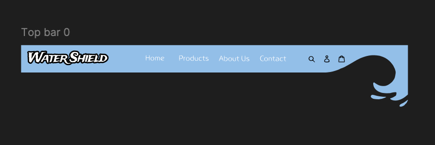
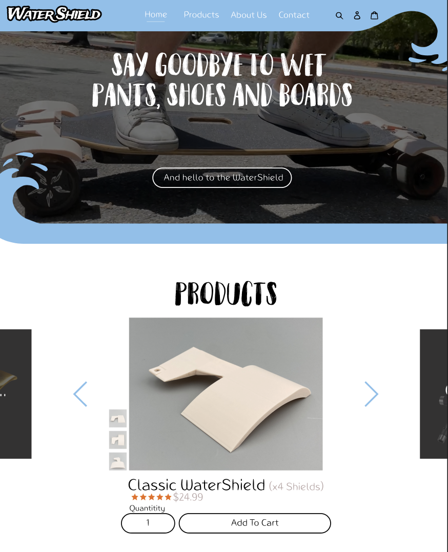
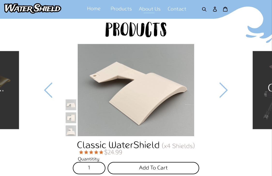
Navigation system and brand expression.Hero section focused on immediate problem recognition.Product page optimized for clarity and low purchase friction.
Key decisions
Strong hero image and single-sentence value prop
Problem/solution explained with minimal scrolling
Simple sections: benefits, fit, FAQ
Quiet, consistent calls-to-action
What I did
Designed site layout and hierarchy
Created UI components and spacing system
Built a clickable Figma prototype
Demo
Walkthrough of the Figma prototype and user flow.
Takeaways
For a product like this, clarity beats persuasion. Reducing uncertainty around fit, install, and real-world effectiveness mattered more than flashy marketing.